Wednesday, 24 November 2010
Drafts 2
This is my second draft of my front page. I have decided to use a different picture because I think that it draws more attention to the magazine because she is just stood staring at the reader. I also changed the font for the heading so that it stands out to the other headings and headline.
This is my second draft of my contents page. I had used the same font for the contents page as the masthead so that the house style is continued. I have also added the pictures that are going to be featured on my contents page.This is my second draft for my double page spread. I have carried on the house style by having the same background colour and the same font for the heading.
Tuesday, 23 November 2010
Masthead Fonts
I have chosen the second font to use as my masthead because I think that it represents the genre as there is a disco ball and that symbolises pop music.
Drafts 1
Here is my first photoshop draft of my front cover. I have decided that I am not going to use this picture on the front cover because she is looking away from the camera and is therefore not drawing the audience in and also because it was took horizontally when it is stretched it does not have the same effect. I have chosen the name stereo love for my masthead as I think that it represents the pop music genre as a lot of the songs are played regularly on the radio because they are widely popular. My tagline is Turn It Up! because when a song comes on the radio that a person likes then they usually tend to turn up the volume.
This is the first photoshop draft of my contents page. I like the picture on this page as she is still looking at the audience but she is turned away which makes it look more secretative which draws the audience in. I have my feature articles next to a picture that will feature in the articles and the regular articles underneath with two pictures of pop artists that will feature in the articles.
This is the first photoshop of my double page spread. I am definatley going to use this image on the double page as she is looking at the camera and the audience. Also because of the camera being higher than the person it makes her seem more down to earth and not a diva like other pop artists.
Photos
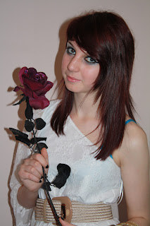
I have narrowed my photos down to two from each outfit, I have chosen a range of poses and shots.
I have decided that these are going to be the three photos that I use on my front page, contents page and double page spread.
Monday, 22 November 2010
Photos
I have taken photos of a person in three different outfits so that I can have a different outfit for my front cover, contents page and double page spread. I used a range of camera angles and shots such as close ups and long shots. I will chose the most suitable picture from each outfit. I have also taken photos of a girlband and boyband to put onto my contents page.
I chose to make a girlband to put on my contents page as I already have a solo artist and pop groups are a major thing in the pop genre. I made them do several different casual poses to make it look like they are real people so that the audience can relate to them. I have decided to use this photo as my photo because it shows that they do not take themselves too serious which will make thew audience want to read about them.
I also decided to use a member of a boyband because they are widely popular in the pop genre. This photo was taken at a concert.
Subscribe to:
Comments (Atom)


